Now that I have been ejected into the private sector I have to use Windows. I have a choice of Windows XP or Windows 7, so as the latter looks slightly less dreadful I went with that. (System 7 is my OS of choice, but I will put up with Mac OS X if I must although that is rapidly going down hill.)
Anyway, Microsoft has some genius ClearType thing that makes fonts look fuzzy and blurred. Apparently this makes text easier to read, but it just gives me a headache. Well done Microsoft.
In fact there seem to be three problems:
The problems are visible in the screenshot below. (I have the window borders set to a dark colour because if the colour is light then I have difficulty distinguishing between the active window and inactive windows.)
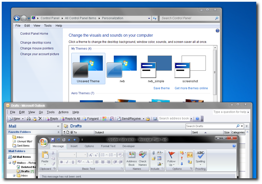
Here I have set the GUI font to Arial, but see that:
To set the main system font to Arial instead of the truly dreadful Segoe UI, some registry keys need faffing with. This isn’t as terrifying as it sounds. Details at http://steve.fsxtreme.com/blogs/2008/01/16/say-no-to-segoe-and-cleartype-on-vista/.
The natural size of Tahoma is 8pt, but Segoe UI is used at 9pt. This means that Tahoma gets scaled and looks fuzzy. Arial works better.
However, as you can see in the screenshot above, I am still left with fuzzy window titles.
Microsoft: a crap looking GUI (like Windows XP) I can live with, but these inconsistencies are infuriating.